
Aspen Music Festival & School
Aspen, Colorado
Brand Strategy & Visual Identity for the Aspen Music Festival & School
Arts Branding LLC selected Ian Alden Russell as senior strategist for this brand strategy project.
The strategy development process included review and synthesis of all communications materials to identify key issues and insights. Srategic recommendations were paired with bespoke tactics to move the voice and identity of Aspen Music Festival and School (AMFS) towards a world-class positioning. Key deliverables included mission, vision and position statements, position pillars and image attributes.
Russell led iterative workshops to co-create brand narratives with AMFS managers from all affected departments, guiding them to a sense of involvement, ownership and pride that they were using their own experience of the brand to better communicate with their various audiences – from students to concert-goers to performers and peer-professionals.
This was their first brand strategy and first comprehensive visual identity that stemmed from a brand strategy. With AMFS, the brand strategy was more than a means to achieve a revised visual identity. The process of co-creating the brand strategy was the goal – a holistic and thorough process that united internal and external stakeholders in a shared language to authentically express, celebrate and amplify the AMFS brand globally.
About the Visual Identity
The Aspen Music Festival and School's new logomark was inspired by the clean, modernist aesthetic of Bauhaus design legend Herbert Bayer, who came to Aspen in the 1940s with Walter and Elizabeth Paepcke and whose sensibility informed every aspect of Aspen's transformation from a mining and ranching community to a world-class arts destination. In the shapes can be seen an "A" and an "M," or musical notation, or simply Bauhaus-like shapes. Colors are inspired by both Bayer's aesthetics and the natural beauty and feeling of summer in Aspen.
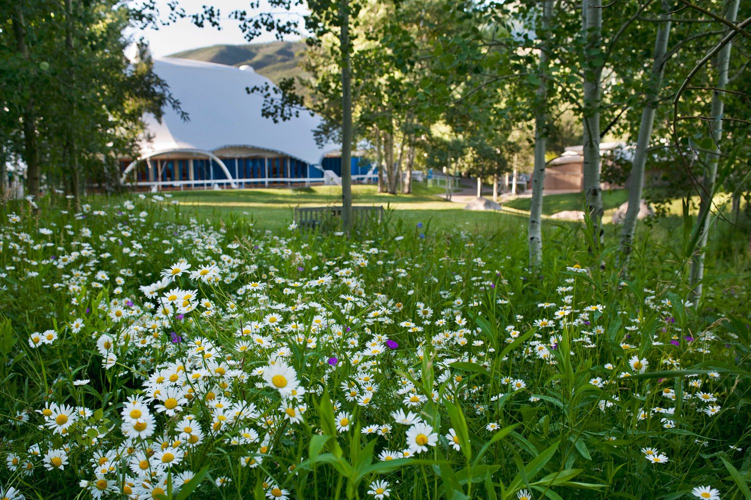
In alignment with the momentous redevelopment of the AMFS's Bucksbaum Campus, this summer the 68-year old institution is unveiling its first unified institution-wide visual identity and first major revision to its logo in decades.
The past decade has seen major changes at the institution, with the appointment of Music Director Robert Spano, the addition of partnerships and programs, and the full redevelopment of the Bucksbaum Campus to a truly world-class facility. The old visual identity no longer adequately represented the AMFS. To address this, the Festival embarked on a two-year journey to better capture its identity in visual design.
The intensive engagement involved extensive research within Aspen, within the industry, nationally, and internationally. The strategy that was developed, based on this research, articulates the mix of extraordinary performance, teaching, natural splendor, and Aspen’s small town charm—a combination that all constituents find uniquely compelling about the AMFS experience. Key within that is better expression of the world-class level to which the institution has risen.
Ultimately, the new visual identity carries the world-class excellence and boldness in its logomark and express its spectacular location, casual, welcoming atmosphere, and transcendent experiences in imagery.

James McNamara, Managing Director, Arts Branding LLC

